
Padsplit
Padsplit is a start-up company specializes in affordable co-living space that serves the lower income demographic in Atlanta
Overview
For many in Atlanta with lower income, housing options are limited, and they often do not have enough money for necessary deposits. Some are new to the city with no local support and might even be staying in their cars while they're slowly getting on their feet.
Enter PadSplit. They provide all-inclusive rooms in homes which are divided into separate furnished bedrooms with a shared kitchen and living room
Members pay one affordable payment, allowing them to focus on their career, education, and savings.
The Membership model:
Fill out a Resident Application online to become a resident
Pay $25 which includes a background check and verification of employment
Projected to include membership perks prior to placement in housing unit
Our Role
PadSplit currently uses their website to share general information and provide basic contact or resident application options.
They had engaged our team to work on centralized communication and bill payment methods for members, with projections to provide engagement for member benefits and landlord property data.


The Partner model:
Home owners enter into a partnership with Padsplit in an LLC agreement
Padsplit takes ownership of the utilities and manages the property
Owners receive their revenue without the challenge of managing the properties
Project Detail
Team: Nathan Nguyen, Matthew Martz, and Lisa Fountain
Duration: Three weeks
My Role: User research and interviews, competitor analysis, ideation, wire-framing, prototype testing, & hi-fi mockups
Tools: Sketch, InVision
Expected Deliverables: Key takeaways from user research, suggested features, product sketches & wireframes, user stories and user flows
Heuristics & Site Suggestions
Our first step in the process was to evaluate the current desktop site in order to gain a better understanding of the brand and assess its usability. Key findings were presented to Padsplit staff along with improvement suggestions. Some examples include:
- Copy does not match the mission statement
- There are no links to their existing social media pages
- Call-to-action buttons are not explicit & compelling

Competitive Analysis
I started my competitive analysis by identifying companies that offer similar services and examining their general characteristics, page elements, and target demographic. Some notable features included by the market leaders in co-living:
- Immediate explanation of "co-living"
- Imagery of units & properties
- Captivating landing pages
- Graphic or video walkthrough of the service
- Information regarding on-boarding

User Survey & Interviews
Our next step was to create a series of survey questionnaire for members. 14 out of 35 users responded. We also interviewed 3 resident members and 2 property owners. The main takeaways:
- Padsplit residents prefer not to interact with their roommates
- Communication line between members and Padsplit staff are fractured into several channels
- Members would like to see discount benefit to necessities
- Property owners need a way to centralize communication, view their property information, and access documents and records

Persona
We created a a few user personas based on the findings synthesized during our research phase in order to guide our design decisions


Design Direction
We believe that by creating a member and landlord portal for PadSplit residents and landlords, we will achieve a better user experience for all stakeholders involved, which includes: centralized payment, communication and benefits engagement, and centralized landlord information.
We will know this to be true when we see users communicate and pay bills through the portal with minimal error and when we see fewer individual requests for information from landlords.
Ideation and Site Maps
Our design process began with ideation. We brainstormed designs and sketched out possible layouts for the user portal
With the first layout iteration created, the site maps for the members and owners were also designed. These served as the skeleton to guide the screens that would make up the prototype


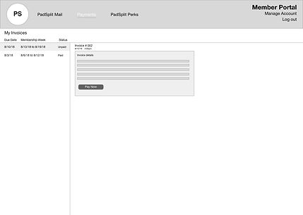
Wireframes and Prototype
Having established a framework to guide our prototyping, we proceeded to create the wireframe pages in medium fidelity. The following is a selection of wireframe pages we designed for the user portal.


.png)
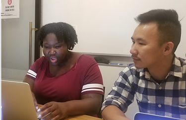
Prototype Testing & Re-iteration
With the help of Padsplit staff, we were able to coordinate and conduct one round of user testing with two resident members and one property owner. The invaluable feedback gained from this process was incorporated into our design reiteration.

High Fidelity Mockups
While the high fidelity mockups were not part of our deliverables initially, we were able to draw up some conceptual examples for the purpose of demonstration using the style guide they had provided.


Key Takeaways
This project certainly has presented some unique challenges to our team. The survey and interview data indicated that there was a strong need for a mobile-friendly application. Due to time constraint and project scope, however, we could only advise the client to take the mobile approach in the near future. Going beyond that, it would be most beneficial to ideate further and refine the "Resident Member Perks" features. This would reinforce the client company's mission statement.